数组字段
数组字段(Array Field)用于需要包含一组"可重复"字段的场景。它存储了一个包含你定义字段的对象数组。这些字段可以是任何类型,包括其他数组字段,从而实现无限嵌套的数据结构。
数组字段适用于从简单到复杂的多种内容类型,例如:
- 包含图片(上传字段)和标题(文本字段)的"轮播图"
- 导航结构,编辑者可以指定包含页面(关联字段)和"在新标签页打开"复选框字段的导航项
- 活动日程"时间段",需要指定开始和结束时间(日期字段)、标签(文本字段)和了解更多页面关联字段
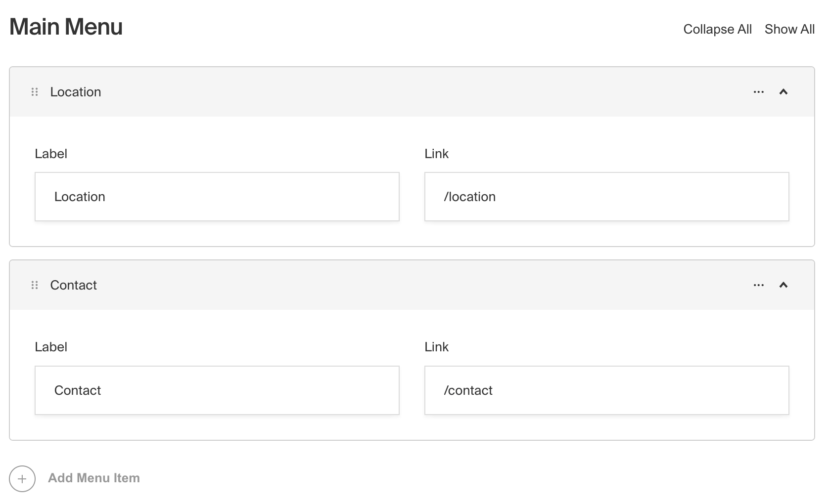
管理面板中显示包含两行的数组字段截图
要创建数组字段,需在字段配置中将type设置为array:
import type { Field } from 'payload'

export const MyArrayField: Field = {
  // ...
  // highlight-start
  type: 'array',
  fields: [
    // ...
  ],
  // highlight-end
}
配置选项
| 选项 | 描述 |
|---|---|
name * | 作为属性名用于数据库存储和检索。了解更多 |
label | 在管理面板中用作标题的文本,或包含每种语言键的对象。如果未定义,则根据 name 自动生成。 |
fields * | 对应数组每行的字段类型数组。 |
validate | 提供自定义验证函数,将在管理面板和后端执行。了解更多 |
minRows | 验证时存在值时的最小允许项数。 |
maxRows | 验证时存在值时的最大允许项数。 |
saveToJWT | 如果此字段是顶级字段且嵌套在支持身份验证的配置中,则将其数据包含在用户 JWT 中。 |
hooks | 提供字段钩子来控制此字段的逻辑。更多详情。 |
access | 提供字段访问控制以指定用户可以对此字段数据执行的操作。更多详情。 |
hidden | 完全限制此字段在所有 API 中的可见性。仍会保存到数据库,但不会出现在任何 API 或管理面板中。 |
defaultValue | 提供用于此字段默认值的行数据数组。了解更多 |
localized | 为此字段启用本地化。需要在基础配置中启用本地化。如果启用,将保留此数组内所有数据的单独本地化集合,因此无需将每个嵌套字段指定为 localized。 |
required | 要求此字段必须有值。 |
labels | 自定义管理仪表板中显示的行标签。 |
admin | 管理面板特定配置。更多详情。 |
custom | 用于添加自定义数据的扩展点(例如插件) |
interfaceName | 创建顶级可重用的Typescript 接口和GraphQL 类型。 |
dbName | 使用 SQL 数据库适配器(Postgres)时字段的自定义表名。如果未定义,则根据 name 自动生成。 |
typescriptSchema | 通过提供 JSON schema 覆盖字段类型生成 |
virtual | 提供 true 以禁用数据库中的字段,或提供字符串路径以将字段与关系链接。参见虚拟字段 |
* 星号表示该属性为必填项。
管理选项
要自定义 Admin Panel 中 Array Field 的外观和行为,可以使用 admin 选项:
import type { Field } from 'payload'

export const MyArrayField: Field = {
  // ...
  admin: {
    // highlight-line
    // ...
  },
}
Array Field 继承了基础 Field Admin Config 的所有默认管理选项,并新增了以下额外选项:
| 选项 | 描述 |
|---|---|
initCollapsed | 设置初始折叠状态 |
components.RowLabel | 作为数组行标签渲染的 React 组件。示例 |
isSortable | 将此值设为 false 可禁用排序功能 |
示例
在这个示例中,我们有一个名为 slider 的 Array Field,它包含了一个简单图片轮播所需的字段集合。数组中的每一行都有 title、image 和 caption 字段。我们还自定义了行标签,在有标题时显示标题,否则显示默认标签。
import type { CollectionConfig } from 'payload'

export const ExampleCollection: CollectionConfig = {
  slug: 'example-collection',
  fields: [
    {
      name: 'slider', // 必填
      type: 'array', // 必填
      label: '图片轮播',
      minRows: 2,
      maxRows: 10,
      interfaceName: 'CardSlider', // 可选
      labels: {
        singular: '幻灯片',
        plural: '幻灯片集',
      },
      fields: [
        // 必填
        {
          name: 'title',
          type: 'text',
        },
        {
          name: 'image',
          type: 'upload',
          relationTo: 'media',
          required: true,
        },
        {
          name: 'caption',
          type: 'text',
        },
      ],
    },
  ],
}
自定义组件
字段
服务端组件
import type React from 'react'
import { ArrayField } from '@payloadcms/ui'
import type { ArrayFieldServerComponent } from 'payload'

export const CustomArrayFieldServer: ArrayFieldServerComponent = ({
  clientField,
  path,
  schemaPath,
  permissions,
}) => {
  return (
    <ArrayField
      field={clientField}
      path={path}
      schemaPath={schemaPath}
      permissions={permissions}
    />
  )
}
客户端组件
'use client'
import React from 'react'
import { ArrayField } from '@payloadcms/ui'
import type { ArrayFieldClientComponent } from 'payload'

export const CustomArrayFieldClient: ArrayFieldClientComponent = (props) => {
  return <ArrayField {...props} />
}
标签
服务端组件
import React from 'react'
import { FieldLabel } from '@payloadcms/ui'
import type { ArrayFieldLabelServerComponent } from 'payload'

export const CustomArrayFieldLabelServer: ArrayFieldLabelServerComponent = ({
  clientField,
  path,
}) => {
  return (
    <FieldLabel
      label={clientField?.label || clientField?.name}
      path={path}
      required={clientField?.required}
    />
  )
}
客户端组件
'use client'
import type { ArrayFieldLabelClientComponent } from 'payload'

import { FieldLabel } from '@payloadcms/ui'
import React from 'react'

export const CustomArrayFieldLabelClient: ArrayFieldLabelClientComponent = ({
  field,
  path,
}) => {
  return (
    <FieldLabel
      label={field?.label || field?.name}
      path={path}
      required={field?.required}
    />
  )
}
行标签
'use client'

import { useRowLabel } from '@payloadcms/ui'

export const ArrayRowLabel = () => {
  const { data, rowNumber } = useRowLabel<{ title?: string }>()

  const customLabel = `${data.title || 'Slide'} ${String(rowNumber).padStart(2, '0')} `

  return <div>自定义标签: {customLabel}</div>
}